CheatStrap
CheatStrap provides you convenient HTML, CSS and JavaScript snippets for making web pages with Twitter Bootstrap 3.
You can simply copy those snippets and paste to your web pages. If you have any questions about Bootstrap 3, feel free to contact us from the form at the bottom of this page.
CheatStrap(チートストラップ)は、Twitter Bootstrap 3を使ってWEBページを作成するのに便利なコードサンプルを提供するサイトです。
Starting / はじめに
To start, just copy the following code.
Bootstrap本体のダウンロードとか、初期設定など難しい事は全くする必要ありません。ただ下のコードをコピーしてファイル名.htmlを作成し、すぐに書き始める事が出来ます。
<!DOCTYPE html>
<html lang="ja">
	<head>
		<meta charset="UTF-8">
		<meta http-equiv="content-type" content="text/html; charset=UTF-8">
		<meta http-equiv="X-UA-Compatible" content="IE=edge">
		<meta name="keywords" content="">
		<meta name="description" content="">
		<meta name="author" content="ENTEREAL">
		<meta name="format-detection" content="telephone=no">
		<meta name="viewport" content="width=device-width, initial-scale=1, minimum-scale=1, maximum-scale=1, user-scalable=no">

		<title>Page Title</title>

		<link rel="stylesheet" type="text/css" href="https://maxcdn.bootstrapcdn.com/bootstrap/3.3.6/css/bootstrap.min.css">
		<link rel="stylesheet" type="text/css" href="https://maxcdn.bootstrapcdn.com/font-awesome/4.5.0/css/font-awesome.min.css">

		<!--[if lt IE 9]>
			<script type="text/javascript" charset="UTF-8" src="http://oss.maxcdn.com/html5shiv/3.7.2/html5shiv.min.js"></script>
			<script type="text/javascript" charset="UTF-8" src="http://oss.maxcdn.com/respond/1.4.2/respond.min.js"></script>
		<![endif]-->
	</head>
	<body>
		<div class="container-fluid">
			// Contents here
			// ここにコンテンツを記述します。
		</div>

		<script type="text/javascript" charset="UTF-8" src="https://ajax.googleapis.com/ajax/libs/jquery/1.11.3/jquery.min.js"></script>
		<script type="text/javascript" charset="UTF-8" src="https://maxcdn.bootstrapcdn.com/bootstrap/3.3.6/js/bootstrap.min.js"></script>
	</body>
</html>
Grid / グリッド
Bootstrapのグリッドは、最初からレスポンシブレイアウトに対応しています。ブラウザの幅に合わせて12個のカラムを最適な幅に調整して表示してくれます。
|
Extra small devices 極小画面 (スマホ等) Phones (< 768px) |
Small devices 小型画面 (タブレット等) Tablets (≥ 768px) |
Medium devices 中型画面 (ノートPC等) Laptops (≥ 992px) |
Large devices 大型画面 (デスクトップPC等) Desktops (≥ 1200px) |
|
|---|---|---|---|---|
|
Grid behavior Gridの挙動 |
Horizontal at all times 常に水平に並ぶ |
Collapsed to start, horizontal above breakpoints 上記幅以上の時に水平に並ぶ |
||
|
Container width ページコンテンツの幅 |
None (auto) | 750px | 970px | 1170px |
|
Class prefix クラス接頭文字 |
.col-xs- |
.col-sm- |
.col-md- |
.col-lg- |
|
# of columns カラム数 |
12 | |||
|
Column width カラム幅 |
Auto | ~62px | ~81px | ~97px |
|
Gutter width カラム間隔の幅 |
30px (15px on each side of a column) 30px (片側15px × 左右) |
|||
|
Nestable 入れ子 (階層化) |
Yes | |||
|
Offsets オフセット (余白作成) |
Yes | |||
|
Column ordering カラム順指定 |
Yes | |||
Sample: 12 columns
サンプル: 12カラム
12個に当分された列をそのまま表示しています。これを基本に次のサンプルのように、目的に合わせてカラム幅を変更していきます。
1/121/121/121/121/121/121/121/121/121/121/121/12
Sample: Left Menu 2 columns
サンプル: 左メニューの2カラム
12個に当分された列の左4列と、右8列に分けた例です。本サイトのように左側にメニュー、右側にコンテンツというレイアウトに使えます。
4/128/12
Sample: Centering 1 column
サンプル: 中央寄せ1カラム
左右に1カラム分の余白を取った、10カラム分の幅を持った1カラムのレイアウトです。
10/12 (with 1/12 margin )
Differnt Version 5 equal width columns
追加カスタム 5等分カラム
デフォルトでは作成できない5等分のカラムレイアウトです。
1 / 5 width1 / 5 width1 / 5 width1 / 5 width1 / 5 width
.col-xs-1_5th,
.col-sm-1_5th,
.col-md-1_5th,
.col-lg-1_5th {
	position: relative;
	min-height: 1px;
	padding-right: 15px;
	padding-left: 15px;
}
.col-xs-1_5th {
	width: 20%;
	float: left;
}

@media (min-width: 768px) {
	.col-sm-1_5th {
		width: 20%;
		float: left;
	}
}
@media (min-width: 992px) {
	.col-md-1_5th {
		width: 20%;
		float: left;
	}
}
@media (min-width: 1200px) {
	.col-lg-1_5th {
		width: 20%;
		float: left;
	}
}
Column / カラム
カラム幅の設定方法です。
| Width | % of page width | HTML Code |
|---|---|---|
| 1 / 1 | 100 % |
解説:12等分した列を12個繋げた幅(=100%)
|
| 1 / 2 | 50 % |
解説:12等分した列を6個ずつ繋げた幅(=50%)
|
| 1 / 3 | 33.33 % |
解説:12等分した列を4個ずつ繋げた幅(=33.3%)
|
| 1 / 4 | 25 % |
解説:12等分した列を3個ずつ繋げた幅(=25%)
|
| 1 / 5 | 20 % |
解説:5等分した1カラム幅(=20%)
|
| 1 / 6 | 16.66 % |
解説:12等分した列を2個ずつ繋げた幅(=16.6%)
|
| 1 / 8 | 12.5 % |
解説:12等分した列を3個繋げた列の中に、更に12等分した6列のカラムの幅(=12.5%)
|
| 1 / 9 | 11.11 % |
解説:12等分した列を4個繋げた列の中に、更に12等分した4列のカラムの幅(=11.11%)
|
| 1 / 10 | 10 % |
解説:5等分した列の中に、更に12等分した6列のカラムの幅(=10%)
|
| 1 / 12 | 8.33 % |
解説:12等分した1カラム幅(=20%)
|
Font Size
デフォルトのフォントサイズです。
h1 heading : 36px Secondary text : 23.4px (65% of 36px)
h2 heading : 30px Secondary text : 19.5px (65% of 30px)
h3 heading : 24px Secondary text : 15.6px (65% of 24px)
h4 heading : 18px Secondary text : 11.7px (65% of 18px)
h5 heading : 14px Secondary text :	9.1px (65% of 14px)
h6 heading : 12px Secondary text :	7.8px (65% of 12px)
h1 heading : 36px Secondary text : 23.4px (65% of 36px)
h2 heading : 30px Secondary text : 19.5px (65% of 30px)
h3 heading : 24px Secondary text : 15.6px (65% of 24px)
h4 heading : 18px Secondary text : 11.7px (65% of 18px)
h5 heading : 14px Secondary text : 9.1px (65% of 14px)
h6 heading : 12px Secondary text : 7.8px (65% of 12px)
Color
初期で用意された、テキストや背景色を変更するためのクラスです。
for Text (Typo)
| Class Name | Color | Sample |
|---|---|---|
| .text-muted | #777777 / rgb(119, 119, 119) |
Sample Text: this is.text-muted class.
|
| .text-danger | #a94442 / rgb(169, 68, 66) |
Sample Text: this is.text-danger class.
|
| .text-warning | #8a6d3b / rgb(138, 109, 59) |
Sample Text: this is.text-warning class.
|
| .text-info | #31708f / rgb(49, 112, 143) |
Sample Text: this is.text-info class.
|
| .text-primary | #337ab7 / rgb(51, 122, 183) |
Sample Text: this is.text-primary class.
|
| .text-success | #3c763d / rgb(60, 118, 61) |
Sample Text: this is.text-success class.
|
※ .text-primary is more ligther than.text-info.
for Table rows, individual cells or Background
| Rows & Cells Class Name |
Color Code | Background Class Name |
Color Code |
|---|---|---|---|
| .active | #F5F5F5 / rgb(245, 245, 245) | - | - |
| .danger | #F2DEDE / rgb(242, 222, 222) | .bg-danger | #F2DEDE / rgb(242, 222, 222) |
| .warning | #FCF8E3 / rgb(252, 248, 227) | .bg-warning | #FCF8E3 / rgb(252, 248, 227) |
| .info | #D9EDF7 / rgb(217, 237, 247) | .bg-info | #D9EDF7 / rgb(217, 237, 247) |
| .success | #DFF0D8 / rgb(223, 240, 216) | .bg-success | #DFF0D8 / rgb(223, 240, 216) |
| - | - | .bg-primary | #337AB7 / rgb(51, 122, 183) |
for Buttons
| Class Name | Color | Hover Color | Border Color | Sample |
|---|---|---|---|---|
| .btn-default | #FFFFFF rgb(255, 255, 255) |
#E6E6E6 rgb(230, 230, 230) |
#CCCCCC rgb(204, 204, 204) |
.btn-default |
| .btn-danger | #D9534F rgb(217, 83, 79) |
#C9302C rgb(201, 48, 44) |
#D43F3A rgb(212, 63, 58) |
.btn-danger |
| .btn-warning | #F0AD4E rgb(240, 173, 78) |
#EC971F rgb(236, 151, 31) |
#EEA236 rgb(238, 162, 54) |
.btn-warning |
| .btn-info | #5BC0DE rgb(91, 192, 222) |
#31B0D5 rgb(49, 176, 213) |
#46B8DA rgb(70, 184, 218) |
.btn-info |
| .btn-primary | #337AB7 rgb(51, 122, 183) |
#286090 rgb(40, 96, 144) |
#2E6DA4 rgb(46, 109, 164) |
.btn-primary |
| .btn-success | #5CB85C rgb(92, 184, 92) |
#449D44 rgb(68, 157, 68) |
#4CAE4C rgb(76, 174, 76) |
.btn-success |
List
各種リストです。
Unorder list
- test
- test
- test
- test
Order list
- test
- test
- test
- test
Definition list
- title
- definition
- title
- definition
- title
- definition
- title
- definition
Unstyled list
- test
- test
- test
- test
Inline list
- test
- test
- test
- test
- test
- test
Horizontal Definition list
- title
- definition text here. definition text here.
- title
- definition text here. definition text here.
- title
- definition text here. definition text here.
- title
- definition text here. definition text here.
Differnt Version Icon list
追加カスタム Icon list
.icon-caret-right
- test
- test
- test
.icon-check-square-o
- test
- test
- test
.icon-plus-square-o
- test
- test
- test
- test
- test
- test
.icon-list > li {
	list-style: none;
}
.icon-list > li:before {
	font-family: 'FontAwesome';
	margin: 0 8px 0 -12px;
}
.icon-list.icon-caret-right > li:before {
	content: '\f0da';
}
.icon-list.icon-check-square-o > li:before {
	content: '\f046';
}

.icon-list.icon-plus-square-o > li:before {
	content: '\f196';
}
Differnt Version Narrow width definition list
追加カスタム Narrow width definition list
- title
- definition text here. definition text here.
- title
- definition text here. definition text here.
- title
- definition text here. definition text here.
- title
- definition text here. definition text here.
.dl-horizontal.dt-100 > dt {
	float: left;
	width: 100px;
	text-align: right;
}
.dl-horizontal.dt-100 > dd {
	margin-left: 120px;
}
Differnt Version Striped definition list
追加カスタム Striped definition list
- title
- definition text here. definition text here.
- title
- definition text here. definition text here.
- title
- definition text here. definition text here.
- title
- definition text here. definition text here.
- title
- definition text here. definition text here.
- title
- definition text here. definition text here.
- title
- definition text here. definition text here.
- title
- definition text here. definition text here.
.dl-horizontal.dl-striped > dt {
	margin-right: 20px;
	padding: 5px 0;
}
.dl-horizontal.dl-striped > dd {
	margin-left: 0;
	padding: 5px 0 0 0;
}
.dl-horizontal.dl-striped > dd:nth-child(4n - 2) {
	background-color: rgba(0, 0, 0, 0.1);
}
Table / 表
Basic table
Add.table class on the table element.
表に.tableクラスを付与します。
| header | header | header |
|---|---|---|
| data | data | data |
| data | data | data |
| data | data | data |
Striped table
Add.table-striped class on the table element.
表に.table-stripedクラスを付与します。
| header | header | header |
|---|---|---|
| data | data | data |
| data | data | data |
| data | data | data |
Condensed table
Add.table-condensed class on the table element.
表に.table-condensedクラスを付与します。
| header | header | header |
|---|---|---|
| data | data | data |
| data | data | data |
| data | data | data |
Bordered table
Add.table-bordered class on the table element.
表に.table-borderedクラスを付与します。
| header | header | header |
|---|---|---|
| data | data | data |
| data | data | data |
| data | data | data |
Hover row
Add.table-hover class on the table element.
表に.table-hoverクラスを付与します。
| header | header | header |
|---|---|---|
| data | data | data |
| data | data | data |
| data | data | data |
Responsive table
Wrap the table with<div class="table-responsive"></div>.
表を<div class="table-responsive"></div>で囲みます。
| header | header | header |
|---|---|---|
| data | data | data |
| data | data | data |
| data | data | data |
* This class only works on small devices (under 768px). See 'Make it better' section if you want to make it scroll on any devices.
※ このクラスは、小画面(768px未満)の時にのみ有効化されます。常に有効にするには次の「追加変更」を参照ください。
Make it better
追加変更
To meke it responsive scroll on any devices, add.force-responsive class on the wrapper.
どの端末でも常に有効にするためには、以下のコードを使い、追加で.force-responsiveクラスを付与して下さい。
| header 1 | header 2 | header 3 | header 4 | header 5 | header 6 | header 7 | header 8 | header 9 | header 10 | header 11 | header 12 |
|---|---|---|---|---|---|---|---|---|---|---|---|
| data | data | data | data | data | data | data | data | data | data | data | data |
| data | data | data | data | data | data | data | data | data | data | data | data |
| data | data | data | data | data | data | data | data | data | data | data | data |
.table-responsive.force-responsive {
	overflow-y: hidden;
}
.table-responsive.force-responsive > .table > tbody > tr > td,
.table-responsive.force-responsive > .table > tbody > tr > th,
.table-responsive.force-responsive > .table > tfoot > tr > td,
.table-responsive.force-responsive > .table > tfoot > tr > th,
.table-responsive.force-responsive > .table > thead > tr > td,
.table-responsive.force-responsive > .table > thead > tr > th {
	white-space: nowrap;
}
				header
				header
				header


				data
				data
				data


				data
				data
				data


				data
				data
				data
Helpper Text alignment in cells
ヘルパークラス セル内での文字配置
This helper-class for table element make th/td cell text alignment whatever they are in thead/tbody/tfoot.
表内のthead/tbody/tfootにあるセルのテキスト位置を変更するクラスです。
| header | header | header | header |
|---|---|---|---|
| header | data | data | data |
| header | data | data | data |
| header | data | data | data |
| header | header | header | header |
|---|---|---|---|
| header | data | data | data |
| header | data | data | data |
| header | data | data | data |
.th-tc th {
	text-align: center;
}
.th-tr th {
	text-align: right;
}
.th-tl th {
	text-align: left;
}

.td-tc td {
	text-align: center;
}
.td-tr td {
	text-align: right;
}
.td-tl td {
	text-align: left;
}
Text alignment in a thead, tbody and/or tfoot
| header | header | header | header |
|---|---|---|---|
| header | data | data | data |
| header | data | data | data |
| header | data | data | data |
| header | header | header | header |
|---|---|---|---|
| header | data | data | data |
| header | data | data | data |
| header | data | data | data |
.thead-tc thead th,
.thead-tc thead td {
	text-align: center;
}
.thead-tr thead th,
.thead-tr thead td {
	text-align: right;
}
.thead-tl thead th,
.thead-tl thead td {
	text-align: left;
}

.tbody-tc tbody th,
.tbody-tc tbody td {
	text-align: center;
}
.tbody-tr tbody th,
.tbody-tr tbody td {
	text-align: right;
}
.tbody-tl tbody th,
.tbody-tl tbody td {
	text-align: left;
}

.tfoot-tc tfoot th,
.tfoot-tc tfoot td {
	text-align: center;
}
.tfoot-tr tfoot th,
.tfoot-tr tfoot td {
	text-align: right;
}
.tfoot-tl tfoot th,
.tfoot-tl tfoot td {
	text-align: left;
}
Form / フォーム
Alert / アラート
Info Alert text
Tab
............
$('#sample-tab a').click(function(e) {
	e.preventDefault();
	$(this).tab('show');
});
Make it better
To prevent showing dotted line around tabs, add the small css style on it.
#sample-tab > .nav > li > a {
	outline: none;
}
Differnt Version
Upside down Tab
Tab pane #1Tab pane #2Tab pane #3Tab pane #4
.tab-upside-down {
	border-top: 1px solid #DDD;
	border-bottom: none;
}
.tab-upside-down > li {
	margin-top: -1px;
	margin-bottom: 0;
}
.tab-upside-down > li > a {
	border-radius: 0 0 4px 4px;
	outline: none;
}
.tab-upside-down > li > a:hover {
	border-color: #DDD #EEE #EEE #EEE;
}
.tab-upside-down > li.active > a,
.tab-upside-down > li.active > a:focus,
.tab-upside-down > li.active > a:hover {
	border-color: transparent #DDD #DDD #DDD;
}
Modal
Accordion
Make it betterContents 1Contents 2Contents 3
Because it has too many IDs and Classes, and the only<a></a> links are clickable, not easily understadable especially for beginner users. Instead of this, we override small CSS code and jQuery script.
Collapsible Group Item #1
Collapsible Group Item #2
Collapsible Group Item #3
#accordion-better .panel-heading {
	cursor: pointer;
}
#accordion-better .panel-heading > .panel-title > a {
	text-decoration: none;
	outline: none;
}
Collapsible Group Item #1
Contents 1Collapsible Group Item #2
Contents 2Collapsible Group Item #3
Contents 3
Callout
It's not an official compornent but exists on the Bootstrap official dodocument.
	Callout heading text
	content text
Callout heading text
content text
Callout heading text
content text
Callout heading text
content text
Callout heading text
content text
.callout {
	border-width: 1px 1px 1px 5px;
	border-style: solid;
	border-color: #EEE;
	border-radius: 3px;
	margin: 20px 0;
	padding: 20px;
}

.callout-danger {
	border-left-color: #ce4844;
}
.callout-danger > h4 {
	color: #ce4844;
}
.callout-warning {
	border-left-color: #aa6708;
}
.callout-warning > h4 {
	color: #aa6708;
}
.callout-info {
	border-left-color: #1b809e;
}
.callout-info > h4 {
	color: #1b809e;
}
Card

		Young girl
		April 10, 2015
		Shooted by PTX

Desert
April 10, 2015
Shooted by PTX
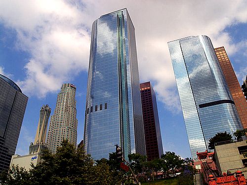
Skyscrapers
April 10, 2015
Shooted by PTX
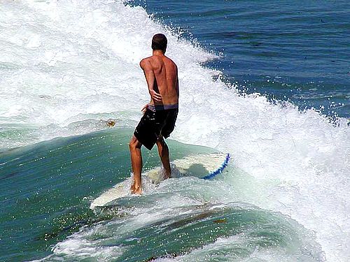
Surfing
April 10, 2015
Shooted by PTX
Young girl
April 10, 2015
Shooted by PTX
.card {
	border-radius: 4px;
	box-shadow: 0 0 5px 5px rgba(0, 0, 0, 0.3);
}
.card > img:first-child {
	width: 100%;
	border-radius: 4px 4px 0 0;
}
.card > .card-info {
	padding: 10px;
}
Price Table
Free Trial Plan
Plan Name Aside
- Shared Server
- 2GB Memory
- 10GB HDD
-
SLA 95.0 %
- Wide backbone network
Standard Plan
Plan Name Aside
- Shared Server
- 2GB Memory
- 20GB HDD
- SSL available
-
SLA 95.0 %
- Wide backbone network
Popular Plan
Plan Name Aside
- Shared Server
- 4GB Memory
- 50GB HDD
- SSL available
-
SLA 97.5 %
- Wide backbone network
Premium Plan
Plan Name Aside
- Virtual Private Server
- 16GB Memory
- 5GB SSD +100GB HDD
- SSL available
-
SLA 99.999 %
- Wide backbone network
Free Trial Plan
Plan Name Aside
- Shared Server
- 2GB Memory
- 10GB HDD
- SLA 95.0 %
- Wide backbone network
FreeStandard Plan
Plan Name Aside
- Shared Server
- 2GB Memory
- 20GB HDD
- SSL available
- SLA 95.0 %
- Wide backbone network
$ 29.9 / moPopular Plan
Plan Name Aside
- Shared Server
- 4GB Memory
- 50GB HDD
- SSL available
- SLA 97.5 %
- Wide backbone network
$ 49.9 / moPremium Plan
Plan Name Aside
- Virtual Private Server
- 16GB Memory
- 5GB SSD + 100GB HDD
- SSL available
- SLA 99.999 %
- Wide backbone network
$ 99.9 / mo
.price-table {
	display: inline-block;
	text-align: center;
	margin: 0 auto;
}
.price-table > .plan-box {
	position: relative;
	float: left;
	display: inline-block;
	width: 180px;
	margin: 0;
	z-index: 100;
}
.price-table > .plan-box.plan-enphasize {
	width: 210px;
	box-shadow: 0 0 5px 5px rgba(0, 0, 0, 0.2);
	margin-right: -5px;
	margin-left: -5px;
	z-index: 1000;
}
.plan-box > .plan-header {
	background-color: #337AB7;
	margin-top: 15px;
	padding: 10px 15px;
}
.plan-box.plan-enphasize > .plan-header {
	margin-top: 0 !important;
	padding: 20px 30px 15px 30px;
}
.plan-box > .plan-header > .plan-name {
	color: #FFF;
	font-size: 30px;
	font-weight: bold;
	margin: 0;
}
.plan-box > .plan-header > .plan-name-aside {
	color: #FFF;
	font-size: 12px;
	font-weight: normal;
	margin: 0 0 10px 0;
}
.plan-box > .plan-header > img {
	width: 80px;
	height: 80px;
	border-radius: 50%;
	margin: 0 auto;
}
.plan-box > .plan-body {
	background-color: #FFF;
}
.plan-box > .plan-body > ul {
	list-style: none;
	margin: 0;
	padding: 0;
}
.plan-box > .plan-body > ul > li {
	background-color: #FFF !important;
	border-bottom: 1px solid #337AB7;
	padding: 10px 0;
}
.plan-box > .price-label {
	background-color: #337AB7;
	padding: 10px 15px;
}
.plan-box > .price-label > .price-prefix {
	color: #FFF;
	font-size: 12px;
	margin: 0;
}
.plan-box > .price-label > .price-tag {
	color: #FFF;
	font-size: 30px;
	font-weight: bold;
	line-height: 30px;
	margin: 0 5px;
}
.plan-box > .price-label > .price-suffix {
	color: #FFF;
	font-size: 12px;
	margin: 0;
}
.plan-box > .plan-footer {
	background-color: #FFF;
	padding: 10px;
}

.plan-box:nth-child(1) > .plan-header,
.plan-box:nth-child(1) > .plan-body > ul > li,
.plan-box:nth-child(1) > .price-label {
	background-color: #afcee9;
	border-color: #afcee9;
}
.plan-box:nth-child(2) > .plan-header,
.plan-box:nth-child(2) > .plan-body > ul > li,
.plan-box:nth-child(2) > .price-label {
	background-color: #5f9dd3;
	border-color: #5f9dd3;
}
.plan-box:nth-child(3) > .plan-header,
.plan-box:nth-child(3) > .plan-body > ul > li,
.plan-box:nth-child(3) > .price-label {
	background-color: #2c6aa0;
	border-color: #2c6aa0;
}
.plan-box:nth-child(4) > .plan-header,
.plan-box:nth-child(4) > .plan-body > ul > li,
.plan-box:nth-child(4) > .price-label {
	background-color: #163550;
	border-color: #163550;
}
Social Button
.social-btn {
	display: block;
	color: #FFF;
	text-align: center;
	padding: 10px;
}
.social-btn:hover {
	color: #EEE;
	text-decoration: none;
}
.bg-tw {
	background-color: #10A5DE;
}
.bg-fb {
	background-color: #284A95;
}
.bg-gp {
	background-color: #D04C3C;
}
.bg-ln {
	background-color: #00C300
}